Iconography
Stroke widths, grid sizes, and naming conventions for every icon shipped.
Icon sources
The design system consumes two open-source icon libraries (ADR-022). Each surface uses exactly one primary library; flags and multi-color brand marks are separate asset classes.
Phosphor — Admin-UI
242 canonical icons (233 Figma Admin-UI + 9 EXTRAS per ADR-022-amend-01, incl. 25 Figma aliases). Install @phosphor-icons/react, import per icon, wrap with the PhosphorIcon component.
Vuesax — Storefront
660 canonical names (748 Figma layers; 88 brand/crypto assets excluded pending a vendor ADR). Import SVG paths from vuesax-icons and wrap with the VuesaxIcon component.

Flags — region-flags
Country flags are national symbols, not UI icons. Single source: the region-flags npm package (google/region-flags). Render with the FlagIcon component and an ISO 3166-1 alpha-2 country code.
Brand marks
Multi-color brand marks (Google, Apple, Facebook, etc.) with fixed fills per brand guidelines. Rendered via the unified BrandIcon component — Google is just one brand in the set, not a separate library.
Icon sizes
Seven canonical pixel sizes (ADR-021). Pick the size that matches your use case.
Click any token to copy it.
Documented exceptions (ADR-021)
Three categories are intentionally outside the default size/stroke contract.
Exception B — internal glyph stroke 2.5/3
Checkmarks and crosses inside 12–16px control boxes (Checkbox, Listbox, Stepper) use thicker strokes for visibility. Interface icons stay at 1.5/2.
Exception C — LARGE_GRAPHIC 40–64px
Hero, stats, and empty-state illustrations are decorative graphics, not UI icons. They fall outside the size convention entirely.
Exception D — brand color on icon
Brand teal on an icon stroke is valid only when the icon IS the brand mark on a non-tinted surface. Never inside tinted banners or competing with text.
Icon catalog
Live samples from each source. The full registries are typed unions — PhosphorIconName (242: 233 Figma + 9 EXTRAS per ADR-022-amend-01) and VuesaxIconName (660) — exported from the design-system barrel.
Phosphor samples (Admin-UI)
Vuesax samples (Storefront names)
Country flags
The region-flags npm package (google/region-flags) covers ~250 ISO 3166-1 countries AND the 13 Canadian provinces/territories (ISO 3166-2:CA) — one library for every flag (ADR-025).

ca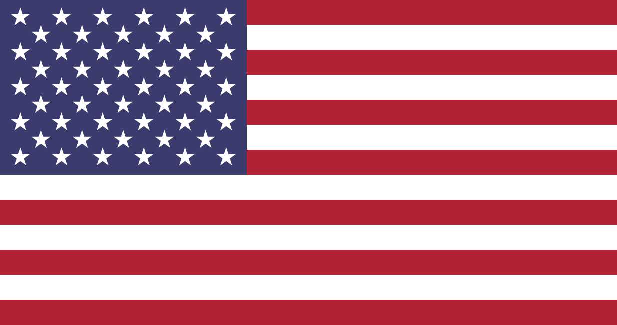
us
gbfr
de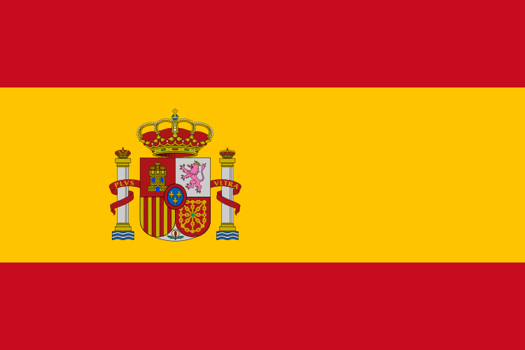
esCanadian provinces & territories
The 13 Canadian provinces and territories (ISO 3166-2:CA) come from the same region-flags package as country flags (ADR-025) — render with FlagIcon country="qc". Province codes take precedence over identical country codes (nl = Newfoundland, not the Netherlands).

ab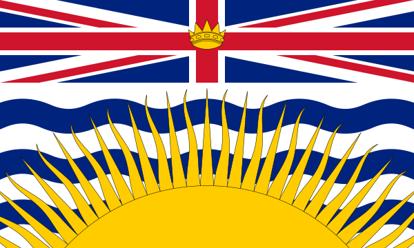
bc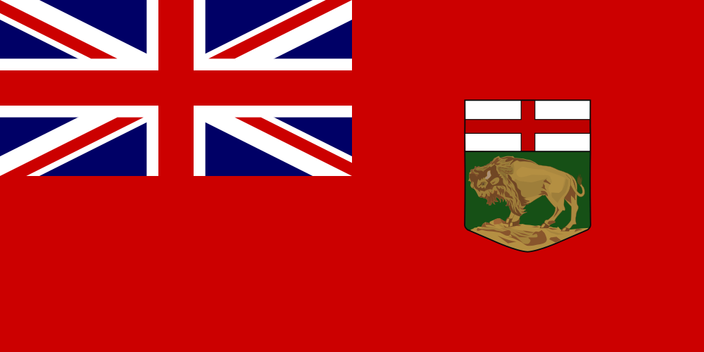
mb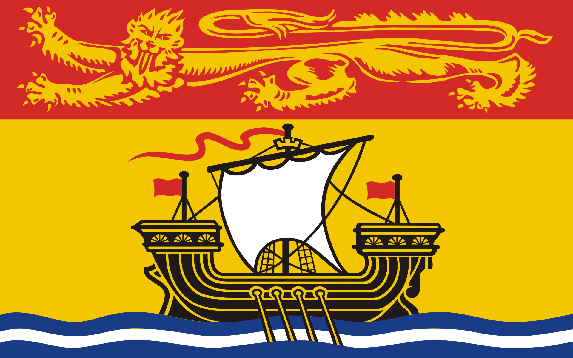
nb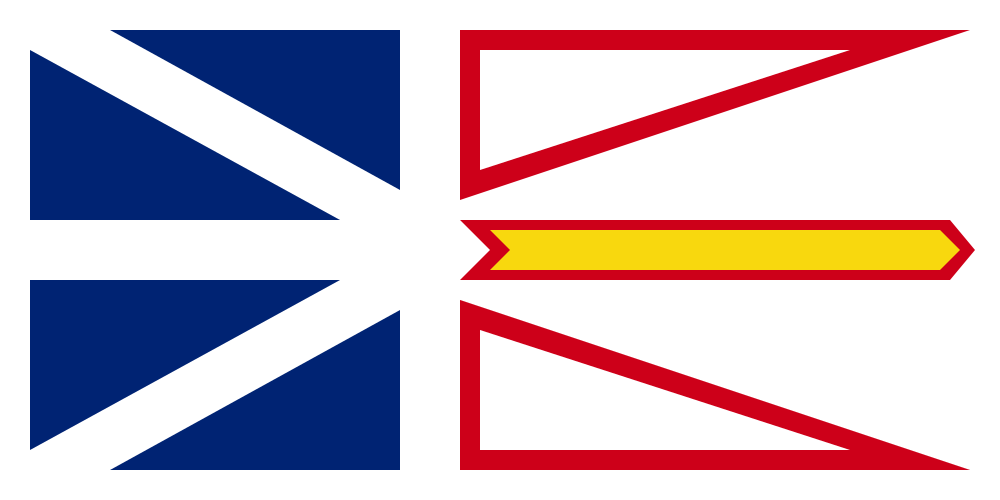
nl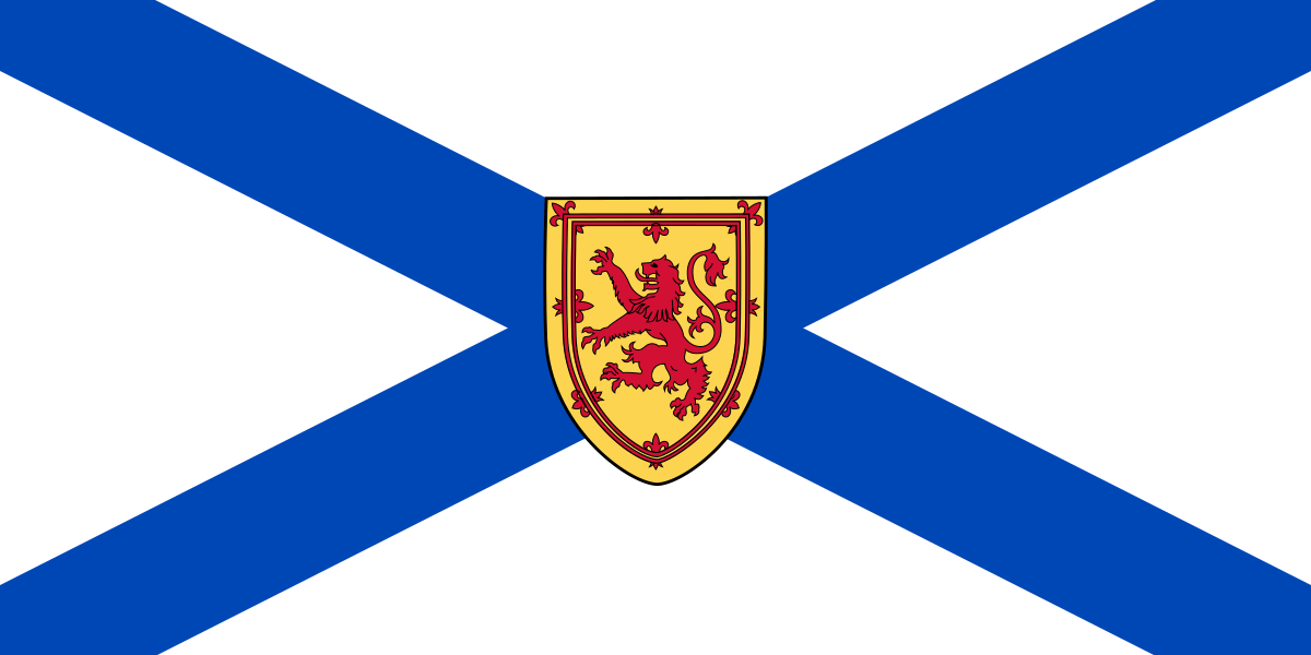
ns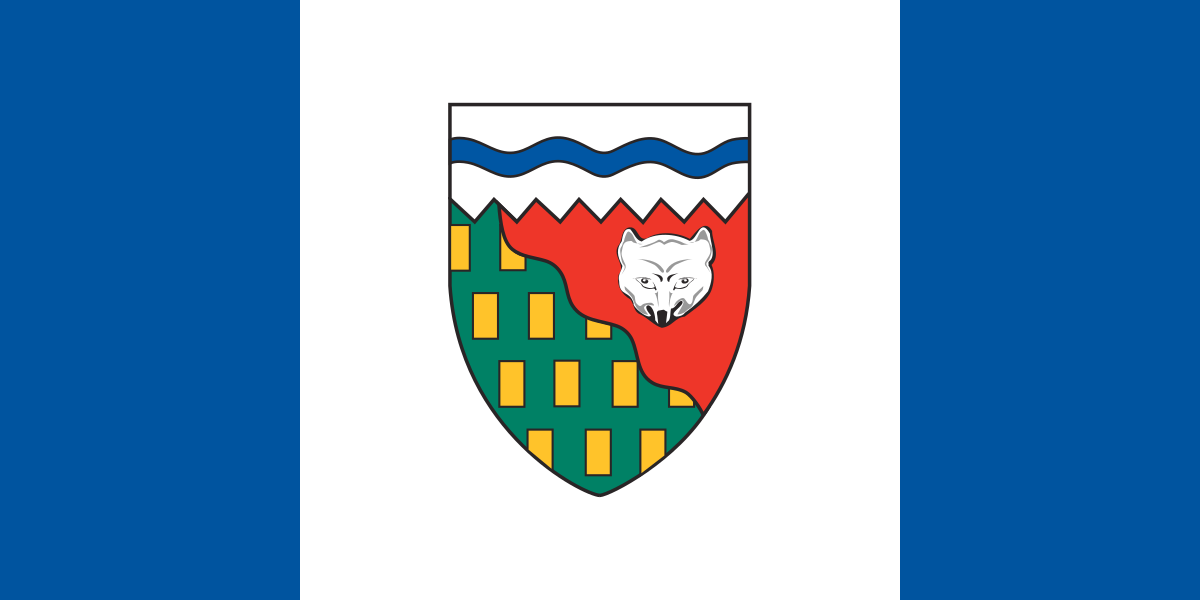
nt
nu
on
pe
qc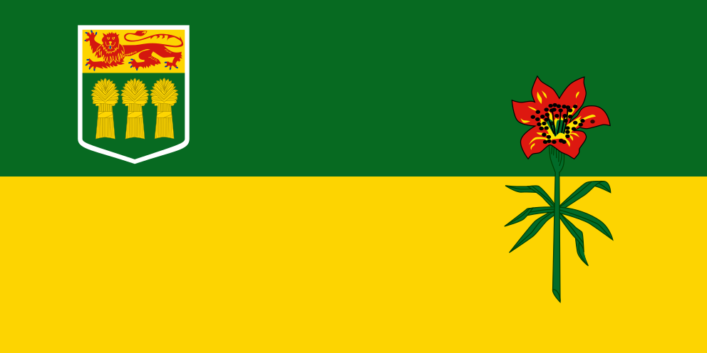
sk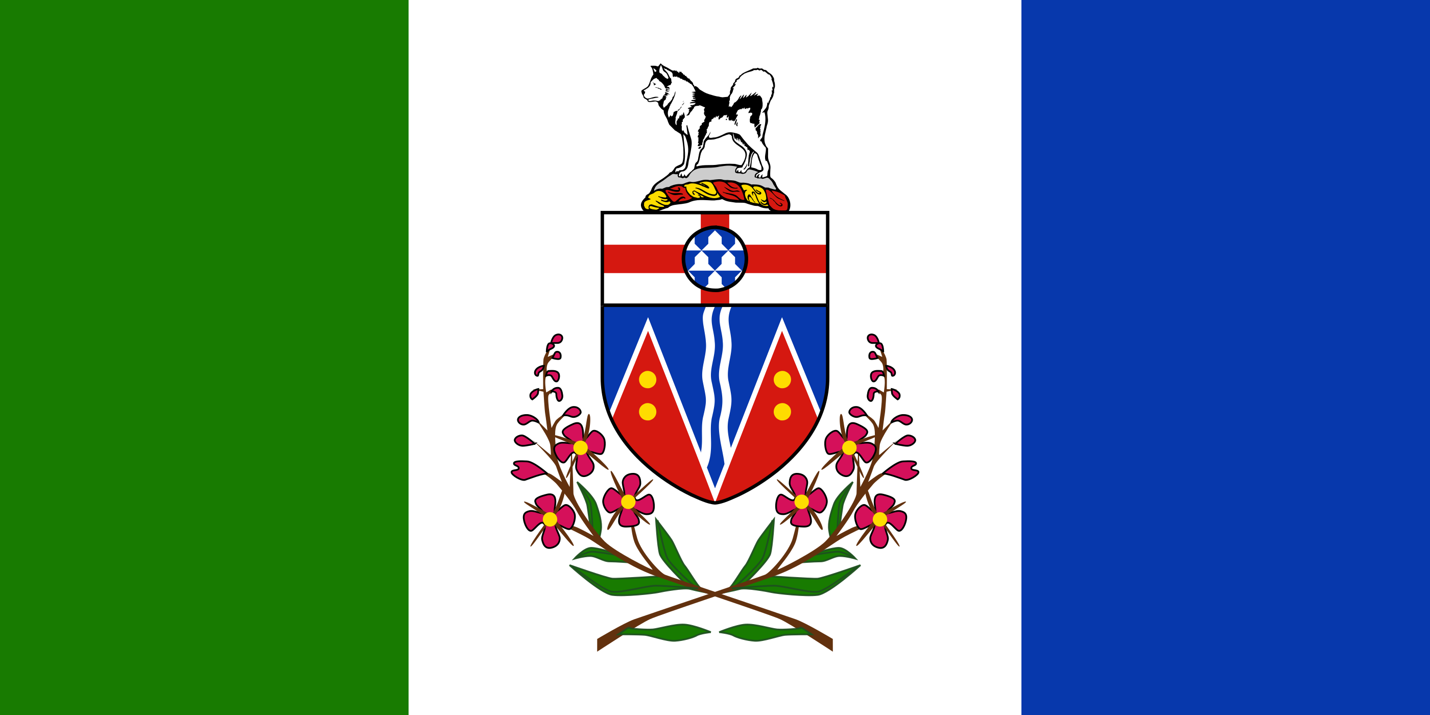
ytBrand marks
All brands live in one registry (BrandIcon name=... for vendored multi-color Originals, BrandIcon icon=... for mono via react-icons). Google is just one brand — not a separate library. Apple Pay multi-color, Apple Wallet, and Add to Apple Wallet follow the vendor path.
google (4 fills)apple (mono)facebook (mono)googlepay (mono)paypal (mono)Payment & wallet — vendor path
Apple Pay, Google Pay (multi-color), Google Wallet, and the Add to Apple Wallet badge are not re-drawn here. Google Pay multi-color is the standard G Pay wordmark with the 4-color G — use GoogleOriginal composited with the mono Pay lockup from Google Brand resources. Apple Pay and Apple Wallet are gated Apple assets — download from Apple Marketing Resources and use as-is.
- Google Pay (multi-color): the brand registry's 'google' original composited with the official mono "Pay" lockup — vendor from Google Brand resources.
- Apple Pay + Apple Wallet + "Add to Apple Wallet": gated Apple badge assets — download from Apple Marketing Resources, render as-is (no recolor, no redraw).
Usage
Icons are wrapper components: import the glyph per-icon (tree-shakeable), pass it to the wrapper, keep sizes in the ADR-021 set.
import { SealCheck } from '@phosphor-icons/react'
<PhosphorIcon icon={SealCheck} size={20} />import walletAdd from 'vuesax-icons/linear/wallet-add.svg'
<VuesaxIcon name="wallet-add" src={walletAdd} size={20} /><FlagIcon country="fr" size={16} aria-label="Français" />import { PhosphorIcon, VuesaxIcon, FlagIcon, BrandIcon } from '@epasslive/design-system'
<BrandIcon name="google" size={18} />
<BrandIcon icon={SiApple} size={20} />Accessibility
Icon-only controls must be accessible to screen readers and usable on touch devices.
- IconButton requires ariaLabel (string) — the icon is decorative, the label is the accessible name.
- IconButton enforces a 44x44px minimum tap target via the --ep-tap-min CSS variable (WCAG 2.5.5 Target Size).
- Decorative icons inside buttons or links must have aria-hidden="true" on the icon span.
- Icon stroke color must meet WCAG 1.4.3 contrast ratio (4.5:1 for body-size icons, 3:1 for large icons).
Roadmap
88 brand + crypto-coin assets from the Storefront Figma file are excluded pending a vendor ADR. 26 names overlap between Admin-UI and Storefront libraries.